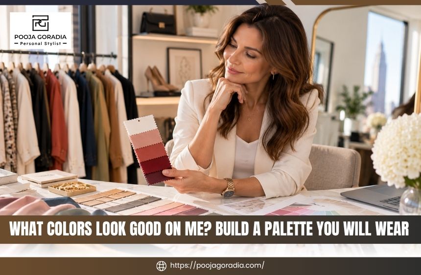
What Colors Look Good on Me? Build a Palette You Will Wear
The question “what colors look good on me?” usually comes up when your closet is full but getting dressed still feels uncertain.
You may own plenty of black, beige, or other safe choices, yet wonder why some colors make you look rested while others seem to drain your complexion or overpower your features.
Color analysis can make those decisions easier, but it works best as a flexible styling tool rather than a strict list of rules.
In this guide, you will learn how skin undertones, seasonal color analysis, contrast, depth, and personal preference come together to create a personal color palette you can use for everyday outfits, shopping, workwear, events, and wardrobe edits.
What Colors Look Good on Me? Start With More Than Your Skin Tone
When someone asks what colors look good on them, the first instinct is often to identify a skin-tone category.
That can be a useful starting point, but it does not tell the whole story. Two people with similar skin tones may look best in entirely different versions of blue, red, green, or beige.
The most helpful color decisions consider the relationship between your natural coloring and the color you are wearing. That relationship includes temperature, depth, clarity, and contrast.
It also includes the practical question that generic color charts rarely answer: will this shade work with the clothes you already own and the way you actually dress? Once you see the pattern, answering what colors look good on me becomes a more practical wardrobe exercise.
Why a Color Can Look Different From Person to Person
A color does not exist in isolation. Its effect changes depending on what surrounds it, where it sits on the body, and how close it is to your face.
A warm tomato red may energize one person, while a cooler raspberry red may create a more balanced effect for someone else.
A bright white shirt may look crisp and intentional on one wearer but stark next to another person’s softer coloring. Texture and contrast can change the answer to what colors look good on me even within the same color family.
Fabric matters, too. A matte wool, shiny satin, faded denim, and sheer knit can make the same color appear deeper, softer, brighter, or more casual.
This is one reason online color swatches and generic “best colors” lists can be misleading. They cannot account for material, lighting, styling, or the rest of the outfit.
The Four Color Qualities to Notice
Temperature describes whether a color leans warm, cool, or relatively balanced. Warm colors often have yellow, golden, or earthy qualities. Cool colors may have blue, pink, or icy qualities. Neutral colors sit somewhere between, although very few colors are perfectly neutral in every fabric and lighting condition.
Value describes how light or dark a color is. Pale blue, medium denim, and deep navy share a color family but have different visual weight. Chroma describes intensity. A clear, saturated emerald is more intense than a muted sage.
Contrast describes the difference between the lightest and darkest elements in your natural coloring or outfit. When you wonder what colors look good on me, compare nearby shades instead of judging one color in isolation.
These qualities help explain why you may like a color in theory but dislike a particular version of it on yourself. You may not dislike green; you may simply prefer a deeper, softer, warmer, or less saturated green.
Flattering Does Not Mean Limiting
A personal palette should help you make decisions, not make your wardrobe feel smaller. If a color you love is not your easiest shade near the face, you can still wear it through shoes, bags, trousers, skirts, outerwear, or a patterned garment that includes more harmonious colors.
Personal style also matters. A color that feels expressive, comfortable, and consistent with your identity may deserve a place in your wardrobe even if it is not the color that creates the strongest visual harmony.
The goal is not to become someone else. It is to understand your options so you can choose intentionally. If you are asking what colors look good on me, this comparison is more useful than a rigid rule.
How to Understand Skin Undertones Without Guessing
Skin undertone is the subtle color beneath the surface of your skin. It is different from surface tone, which can change with sun exposure, seasonal shifts, redness, or skincare. Undertone is often described as warm, cool, or neutral, but real people do not always fit neatly into one category.
Understanding undertone can help you compare colors more thoughtfully, especially when choosing tops, dresses, scarves, glasses, jewelry, and makeup-adjacent clothing colors. It should not be treated as a final verdict based on one quick test.
Warm, Cool, and Neutral Undertones
Warm undertones may appear golden, peachy, yellow, or olive. Cool undertones may appear pink, rosy, bluish, or red.
Neutral undertones can show a blend of warm and cool qualities or may respond well to a wider range of colors. Testing in consistent daylight gives a clearer answer to what colors look good on me.
Olive coloring can be particularly difficult to classify because it may appear warm, cool, or muted depending on lighting and surrounding colors. A person can also have a warm undertone but look better in a cooler, softer version of a color because depth or intensity is the more important factor.
Why a Skin Undertone Test Is Only a Starting Point
At-home methods can provide clues. You might compare how silver and gold jewelry look, examine whether your veins appear more blue or green, or compare bright white with cream.
You may also consider how your skin responds to sunlight. However, these methods are easily affected by indoor lighting, screen settings, tanning, redness, hair color, and personal preference.
A white-versus-cream comparison, for example, may be difficult if one fabric is brighter, shinier, or heavier than the other. Jewelry can also reflect surrounding colors and may look appealing simply because you prefer its finish.
Use these tests as observations rather than proof. Once you see the pattern, answering what colors look good on me becomes a more practical wardrobe exercise.
The Most Useful Test: Compare Colors Near the Face
A more practical approach is to compare similar colors in different versions. Place a warm red beside a cool red, a soft blue beside a clear blue, or a light neutral beside a deeper neutral.
Look at the effect in natural daylight if possible, without relying on makeup or a filter.
Notice whether the color makes your complexion appear more even, whether your eyes seem clearer, and whether shadows or redness become more noticeable.
Also observe whether the color seems to wear you rather than support you. Take photos in consistent lighting, but remember that cameras can alter color and should not be the only source of judgment.
When the results remain unclear, a professional color analysis can be more useful than repeatedly buying test pieces.
An experienced personal image consultant can compare colors in context and translate the observations into clothing choices that make sense for your lifestyle. A flexible palette makes the question what colors look good on me easier to apply while shopping.

What Is Seasonal Color Analysis and When Is It Useful?
Seasonal color analysis organizes colors into families based on characteristics such as warmth, coolness, lightness, depth, softness, and clarity. The traditional four-season approach includes spring, summer, autumn, and winter. Expanded systems divide those seasons into smaller groups to account for more variation.
The value of seasonal analysis is not the label itself. The value is having a practical explanation for why certain colors feel harmonious and a usable framework for choosing new pieces.
The Four Seasonal Families
Spring palettes are generally associated with warmth, lightness, and clear or lively color. They may include fresh greens, warm corals, peachy tones, and bright but not necessarily neon colors.
Summer palettes are often associated with coolness, softness, and lighter or medium values. Muted rose, dusty blue, soft lavender, and gentle gray may fit this direction, depending on the person’s overall coloring. Testing in consistent daylight gives a clearer answer to what colors look good on me.
Autumn palettes commonly emphasize warmth, depth, and earthy or softened intensity. Rust, olive, warm teal, camel, and rich brown are examples of colors that may appear in an autumn-oriented range.
Winter palettes often include cool, clear, and deeper colors with stronger contrast. Jewel tones, icy lights, crisp neutrals, and dramatic darks may be useful references.
These descriptions are broad. They are not guarantees, and a person may borrow successfully from neighboring palettes when the temperature, depth, or intensity is adjusted.
Why Subcategories Matter
Many people feel frustrated when a four-season chart seems partly right but not fully accurate. That often happens because one dominant quality matters more than the season name. Someone may need softer colors rather than simply “cool” colors.
Another person may need deeper colors, even if they can wear both warm and cool shades. If you are asking what colors look good on me, this comparison is more useful than a rigid rule.
Subcategories can make the framework more precise, but precision should serve your wardrobe. A complicated label is not helpful if you cannot use it when shopping. Your final palette should be simple enough to remember and broad enough to support real outfits.
Choosing a Palette That Works in Real Life
A personal color palette should include more than a page of attractive swatches. It should help you identify reliable neutrals, colors for tops and dresses, accent shades, metals, denim directions, and combinations that suit your routine.
Consider where you need color most. If you wear professional clothing every day, your palette may prioritize polished neutrals and repeatable shirt or knitwear colors. If your wardrobe is casual, denim, outerwear, sneakers, and layers may matter more.
If you attend frequent events, you may want one or two confident statement colors rather than a complete closet of bright pieces. Repeated side-by-side testing helps clarify what colors look good on me more reliably than memory.
Pooja Goradia’s image consultant consultation can be relevant when you want color guidance connected to your full image rather than a standalone chart.
The useful outcome is not simply knowing your season; it is knowing how to shop, combine, and wear the colors that support your life. Repeated side-by-side testing helps clarify what colors look good on me more reliably than memory.
How to Build a Personal Color Palette You Will Actually Wear
Once you understand your strongest color qualities, the next step is applying them to the wardrobe you already own.
A good personal color palette should reduce decision fatigue, make outfit combinations easier, and help you avoid buying attractive pieces that remain isolated in your closet. Your wardrobe provides practical evidence for answering what colors look good on me over time.
Start with what you wear repeatedly. Your most useful palette is usually found at the intersection of your natural coloring, lifestyle, comfort, existing wardrobe, and personal taste. When you wonder what colors look good on me, compare nearby shades instead of judging one color in isolation.
Begin With Wearable Neutrals
Neutrals form the structure of most wardrobes. Black may be a reliable choice for some people, but it is not the only option.
Depending on your coloring, lifestyle, and preferred level of contrast, navy, chocolate brown, charcoal, soft white, cream, camel, taupe, olive, or a blue-based gray may be more versatile. Your wardrobe provides practical evidence for answering what colors look good on me over time.
You do not need to replace every neutral at once. First, notice which ones you already reach for and which ones make your outfits easier.
If a particular neutral feels too harsh near your face, you may still use it in trousers, shoes, belts, bags, or coats while choosing a softer shade for tops and scarves. That is why the question what colors look good on me cannot be answered by undertone alone.
Add Signature Colors and Supporting Accents
After choosing foundational neutrals, select a small group of colors that make you feel confident and that connect with those neutrals. These might include a flattering blue, a distinctive green, a wearable red, a soft pink, or a rich plum.
The right number depends on your wardrobe; a palette does not need to be large to be useful. Testing in consistent daylight gives a clearer answer to what colors look good on me.
Give priority to colors you will wear often. A beautiful shade that only works with one outfit may be better as an accessory or occasional piece.
A slightly less dramatic color that works with several jackets, pants, and shoes may provide more value. Your wardrobe provides practical evidence for answering what colors look good on me over time.
Use Color Placement Strategically
Colors do not have to be all or nothing. If you love a shade that feels less harmonious near your face, wear it below the waist or use it in a print.
You can also place a preferred neutral between the color and your face with a jacket, cardigan, neckline, or scarf. If you are asking what colors look good on me, this comparison is more useful than a rigid rule.
This approach is especially helpful during a wardrobe edit. Instead of discarding a garment because it is not your easiest color, ask whether its placement, layering, or styling can make it useful.
Fit, fabric, condition, and emotional connection should also influence the decision. That is why the question what colors look good on me cannot be answered by undertone alone.
Apply the Palette to Shopping and Outfit Planning
Before shopping, review the colors already in your closet. Identify the pieces you wear most, the combinations that work, and the gaps that repeatedly make getting dressed difficult.
You may discover that you do not need more color; you need a coordinating top, a better neutral layer, or shoes that connect several outfits. Once you see the pattern, answering what colors look good on me becomes a more practical wardrobe exercise.
When considering a purchase, ask three questions:
- Does this color work with at least three items I already own?
- Is it suitable for the settings where I actually get dressed?
- Would I choose it if it were not currently trending or heavily discounted?
The aim is to buy with intention, use more of what you own, and create a wardrobe with long-term value rather than constant replacement. That is why the question what colors look good on me cannot be answered by undertone alone.

Common Color Analysis Mistakes That Make Dressing Harder
Color guidance becomes less useful when it is treated as a rigid identity or a shortcut around the rest of personal style.
The most effective approach leaves room for context, experimentation, and the clothes you genuinely enjoy wearing. Repeated side-by-side testing helps clarify what colors look good on me more reliably than memory.
Treating a Season as a Strict Rulebook
A seasonal label should not make you afraid of half your closet. Color harmony is one consideration among many, including fit, silhouette, fabric, contrast, occasion, and personal expression.
If you love a color outside your recommended range, test a different version or wear it farther from your face before deciding it does not work. Texture and contrast can change the answer to what colors look good on me even within the same color family.
The purpose of analysis is to give you more confidence and better language for comparing colors. It is not to replace your judgment. This is a useful way to explore what colors look good on me without treating a seasonal palette as a rulebook.
Choosing Colors From Online Charts Alone
Online charts are useful for inspiration but unreliable as a final answer. Screens vary, and the same named color can look different across brands, fabrics, and lighting conditions.
“Dusty rose,” “teal,” or “camel” does not have one universal appearance. This is a useful way to explore what colors look good on me without treating a seasonal palette as a rulebook.
Use digital palettes to create a shopping direction, then assess the actual garment. If possible, compare it with your existing clothes and view it in more than one type of light. A flexible palette makes the question what colors look good on me easier to apply while shopping.
Ignoring the Rest of the Outfit
A color may look different when paired with black than when paired with cream, denim, brown, or another color from the same family. This is a useful way to explore what colors look good on me without treating a seasonal palette as a rulebook.
A high-contrast outfit can create a different impression from a tonal outfit using similar shades. Your wardrobe provides practical evidence for answering what colors look good on me over time.
Texture matters as well. A muted color in a polished fabric may feel more formal, while the same color in faded denim may feel relaxed. A flexible palette makes the question what colors look good on me easier to apply while shopping.
Consider the complete outfit rather than judging one garment in isolation. When you wonder what colors look good on me, compare nearby shades instead of judging one color in isolation.
Buying New Colors Before Understanding the Existing Wardrobe
When a closet feels uninspiring, it is tempting to buy a new color palette immediately. That can create more confusion if the underlying issue is poor coordination, too many duplicate items, inconsistent fit, or a lack of practical layers.
Your wardrobe provides practical evidence for answering what colors look good on me over time.
When you wonder what colors look good on me, compare nearby shades instead of judging one color in isolation.
A thoughtful wardrobe review should come first. At Pooja Goradia, personalized wardrobe consultation can help connect color, outfit planning, and shopping decisions without assuming that every problem requires buying more clothes.
When you wonder what colors look good on me, compare nearby shades instead of judging one color in isolation.
If you are deciding between self-guided experimentation and professional support, consider how much time you are spending on trial and error and whether your current wardrobe already contains useful pieces you are not wearing.
That is why the question what colors look good on me cannot be answered by undertone alone.
Wrapping Up
The answer to “what colors look good on me?” is rarely one perfect color or a permanent list of approved shades.
A more useful answer comes from observing your undertone, comparing temperature and intensity, noticing your natural contrast, and building a personal color palette around the clothes and settings that matter in your life. That is why the question what colors look good on me cannot be answered by undertone alone.
Use color analysis and seasonal color analysis as frameworks, not restrictions. Choose reliable neutrals, add a focused group of signature colors, and use placement and layering when a favorite shade feels less natural near your face.
Testing in consistent daylight gives a clearer answer to what colors look good on me.
Most importantly, test your palette against your real wardrobe rather than an idealized one. Testing in consistent daylight gives a clearer answer to what colors look good on me.
If you want help translating color guidance into outfits, shopping decisions, and a wardrobe that feels authentic and easy to use, a consultation with Pooja Goradia can provide a more personalized path.
If you are asking what colors look good on me, this comparison is more useful than a rigid rule.
The next step is to review the pieces you already own, identify the color decisions that keep slowing you down, and bring those questions to an experienced personal stylist. If you are asking what colors look good on me, this comparison is more useful than a rigid rule.