Color Analysis and Outfit Styling: How to Create Cohesive Looks
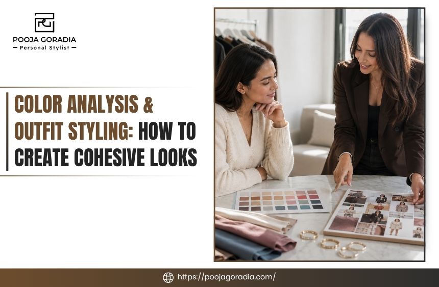
Color analysis can help you stop staring at a closet full of clothes and wondering why nothing seems to work together. When color insights are translated into clothing, neutrals, accents, accessories, and repeatable outfit combinations, your wardrobe starts to feel more coordinated instead of randomly assembled.
The most useful approach is not about following a strict list of approved shades. It is about understanding which colors support your appearance and lifestyle, then using that information to create outfits from pieces you already own.
This guide explains how undertones and color relationships influence outfit styling, how to build a practical wardrobe palette, and when professional styling guidance can help.
How Color Analysis Supports More Cohesive Outfits
Color analysis is most helpful when it becomes a decision-making tool. Identifying colors that complement your natural coloring can make it easier to choose tops, jackets, dresses, scarves, and accessories. However, the real wardrobe benefit comes from understanding how those colors relate to one another.
A palette can give your closet a visual point of view. It can help you recognize why certain pieces combine effortlessly while others require more thought. It can also reveal that the problem is not a lack of clothes. You may simply have too many unrelated colors competing for attention.
The Color Factors That Matter in Clothing
Personal color analysis often considers three broad characteristics: undertone, value, and intensity.
Undertone describes whether a color leans warm, cool, or relatively neutral. Warm colors may have yellow, golden, peach, or rust qualities. Cool colors may have blue, pink, berry, or blue-gray qualities.
This does not mean that someone with a particular undertone can never wear the opposite temperature. It simply provides a useful starting point, especially for colors worn close to the face.
Value refers to how light or deep a color appears. Pale blue, medium blue, and navy share a color family but create very different effects in an outfit.
Intensity describes how muted or vivid a color is. A dusty rose and a saturated fuchsia may both be pink, yet they create different levels of contrast and energy.
These distinctions matter because a color can be technically warm or cool but still feel too bright, too pale, too deep, or too stark for the rest of your wardrobe.
Clothing color analysis is therefore more useful when it considers the complete relationship between your coloring, your clothes, and the way you want to present yourself.
Color Analysis Is a Guide, Not a Set of Restrictions
A professional color analysis can suggest colors that are especially harmonious, but it should not turn getting dressed into a test you can fail. Personal style, comfort, workplace expectations, culture, and emotional connection to clothing all matter.
If you love black but find that it feels severe near your face, try using it in pants, shoes, a skirt, or a bag. You might soften a black top with a flattering scarf, necklace, jacket, or lipstick shade.
If a favorite color is outside your strongest palette, changing its distance from your face or pairing it with a supportive neutral can make it more wearable.
The practical question is not, “Am I allowed to wear this color?” It is, “How can I use this color in a way that feels balanced and intentional?” That shift keeps color analysis connected to real wardrobes rather than abstract rules.
Turn Your Color Palette Into a Wearable Wardrobe
Once you understand your most useful colors, the next step is assigning each one a role. Without that step, a color palette can remain an attractive reference card that does not help on a busy morning. A working wardrobe needs colors that support one another across multiple outfits.
Start With the Pieces You Already Own
Before shopping, place your most frequently worn clothing where you can see it together. Include workwear, casual clothing, outerwear, shoes, bags, and accessories. You are looking for patterns rather than judging every garment individually.
Notice which colors appear repeatedly. You may already have a reliable base of navy, denim, cream, black, gray, camel, olive, or brown.
You may also discover that your favorite accents, such as burgundy, teal, cobalt, coral, or soft pink—appear in only one or two pieces and have no supporting partners. This keeps color analysis tied to outfits rather than isolated color rules.
For each item, ask three questions:
- Does this color work well with several pieces I own?
- Is it most useful near my face, away from my face, or as an accessory?
- Does it support the life I actually lead, or does it belong to an imagined version of my wardrobe?
This exercise often reveals the difference between a flattering color and a useful color. Both matter, but a beautiful shade that works with only one item may not deserve another purchase until you have a styling plan for it.
Build Around Foundation Neutrals
Neutrals create the structure of a wardrobe. They are not limited to black and white. Depending on your coloring and preferences, useful neutrals may include navy, charcoal, chocolate brown, taupe, camel, olive, cream, soft white, or denim. This is a useful way to apply color analysis in everyday dressing.
Choose two or three primary neutrals that can work across your wardrobe. For example, navy and cream may create a softer foundation than black and bright white.
Chocolate brown and ivory may feel more connected to a warm palette. Charcoal and soft white can provide contrast without the sharpness of true black.
This does not mean replacing every existing neutral. It means noticing which neutrals make your wardrobe easier to coordinate. A black blazer can still be valuable even if navy is more harmonious for you.
The blazer may work especially well with denim, burgundy, gray, or a high-contrast outfit rather than with every color in your closet.
Add Supporting Colors and Accents
Supporting colors bridge your neutrals and your more noticeable accents. They might include muted greens, dusty blues, warm reds, soft plums, or medium browns.
These shades often make a wardrobe feel cohesive because they can appear in tops, sweaters, trousers, prints, and layers without dominating every outfit. That is a practical benefit of color analysis when coordinating clothes.
Accent colors are the smaller points of emphasis. They can come from a blouse, shoe, bag, scarf, belt, lipstick, or piece of jewelry. You do not need a large number of accents. A few well-chosen colors can create variety when they are repeated thoughtfully.
A useful starting ratio is to let most of an outfit come from one or two neutrals, add a supporting color, and reserve the strongest accent for a smaller area. This is not a mathematical rule. It simply keeps the outfit from becoming a collection of equally loud pieces.
Use Color to Edit, Not Just to Shop
Color analysis can show you what is missing, but it can also help you stop buying duplicates. If you own five statement tops but lack a neutral layer that connects them to your trousers, the next useful purchase may be a jacket or cardigan rather than another colorful blouse.
At Pooja Goradia, a personal styling process can be useful when your closet contains good individual pieces but lacks a clear system. Reviewing the wardrobe in context makes it easier to identify practical outfit combinations, gaps, and purchases that support several existing garments rather than adding more isolated options.

What Color Combinations Make an Outfit Look Intentional?
Cohesive outfits usually contain a visible color relationship. That relationship does not have to be obvious or highly matched. It may come from similar undertones, repeated colors, controlled contrast, or a neutral foundation that allows one accent to stand out.
Monochromatic and Tonal Dressing
A monochromatic outfit uses different shades of one color family. An all-navy outfit might combine a pale blue shirt, medium blue knit, and dark navy trousers.
A brown-based look could pair a tan sweater with chocolate trousers and a cognac bag. Color analysis can help you judge that relationship more consistently.
Tonal dressing is especially useful when you want an outfit to look polished without relying on high contrast. Varying texture and value keeps the look from appearing flat. A smooth blouse, soft knit, and structured leather accessory can make closely related colors feel deliberate.
Analogous Color Combinations
Analogous colors sit near each other on the color wheel, such as blue and green or red and purple. In clothing, the relationship may be subtle. A teal sweater with navy trousers and a green-gray coat can feel connected without appearing like a matching set.
This approach works well for clients who want more color but do not enjoy dramatic contrast. Choose one dominant color, let the neighboring color support it, and keep the silhouettes relatively simple so the outfit remains easy to read. Color analysis can make that choice easier to repeat.
Complementary Colors With Controlled Contrast
Complementary colors sit opposite each other, such as blue and orange or purple and yellow. Their contrast can be energizing, but wearing two highly saturated complementary colors in equal amounts may feel demanding.
A more wearable version uses one color as the main garment and introduces the complement in a smaller role. For example, a deep blue dress might work with a warm tan shoe or a rust-colored bag.
The colors do not need to be exact opposites for the relationship to work; their temperature and intensity can be softened.
Neutral Plus Accent
This is one of the most reliable formulas for everyday dressing. Start with a neutral base, then add one accent through a top, jacket, shoe, bag, scarf, or jewelry.
A gray suit with a berry blouse, cream trousers with a teal sweater, or navy denim with a rust jacket can all follow this structure. Used this way, color analysis supports clearer wardrobe decisions.
The advantage is flexibility. You can change the accent while keeping the foundation consistent, which creates variety without requiring a completely different wardrobe. It is also a helpful formula when you are still learning which clothing colors feel most natural.
Repeat One Color to Connect the Outfit
Repeating a color in two places often makes an outfit look finished. A burgundy sweater can connect to burgundy flats.
A blue stripe in a shirt can reappear in a bag or stone. A warm metal can echo the warmth in a belt buckle or shoe. That is where color analysis becomes practical.
The repetition does not need to be exact. What matters is that the eye finds a relationship. This is particularly useful with prints. Pull one less-obvious color from a patterned blouse or skirt and repeat it in a smaller accessory.
Let Contrast Match the Occasion
Color contrast also communicates formality and energy. High-contrast combinations can look crisp and expressive, while low-contrast combinations often feel quieter and more relaxed. Neither is automatically better.
For work, you may prefer a controlled contrast that feels clear without distracting from the overall impression. For a weekend outfit, a softer tonal combination may be more comfortable. For an event, a stronger accent or deeper contrast may help the outfit feel intentional in photographs and evening lighting.
When an outfit feels “off,” check more than the colors. The issue may be that the contrast is too strong for the occasion, the accent is repeated too many times, or every item is competing for attention.
How Can Accessories Complete Color-Coordinated Looks?
Accessories are where color coordination becomes especially practical. They can connect garments that do not naturally belong together, adjust the formality of an outfit, and place a color near or away from the face depending on how you want to use it.
Use Shoes and Bags as Anchors
Shoes and bags do not always need to match. They do need to make sense within the outfit. A neutral shoe can calm a colorful look, while a colored shoe can repeat or emphasize a smaller accent. That connection makes color analysis more useful inside a real wardrobe.
If your wardrobe is built around navy and denim, cognac, tan, burgundy, metallics, or a second neutral may give you more options than buying only black accessories. If your clothing contains several warm colors, a cool-toned shoe may look disconnected unless another element brings it into the outfit.
When reviewing accessories, consider frequency of use. A bag that works with three outfits may be more valuable than one that perfectly matches a single dress. The goal is not maximum coordination; it is maximum usefulness.
Coordinate Metals Without Making Them Identical
Gold, silver, rose gold, and mixed metals can influence the temperature and mood of an outfit. If warm colors dominate your clothing, gold or brass may create a natural connection.
If your palette is cooler, silver or pewter may feel more integrated. But personal preference and the design of the jewelry matter as much as a color category.
You can mix metals when the combination looks intentional. Repeating one metal, such as wearing a gold watch with gold-toned earrings, can provide a simple visual link. You can also use a mixed-metal piece as a bridge when your other accessories are not identical.
Place Less-Preferred Colors Strategically
A color that feels less flattering near your face may still be useful in your wardrobe. Move it downward through trousers, skirts, shoes, belts, or bags. Wear it under a jacket, or add a scarf and neckline that introduce a more supportive color near your face.
This approach protects both your personal color analysis and your existing wardrobe. It also prevents the common mistake of discarding useful clothing simply because it is not in the strongest part of your palette.
Make One Outfit Work in Several Settings
Suppose you own a navy dress, a warm-toned belt, neutral pumps, and a colorful scarf. For work, you might use the dress with a structured jacket and restrained jewelry.
For dinner, replace the jacket with the scarf and a more expressive earring. For travel, add a cardigan, flat shoe, and crossbody bag.
The color story remains related, but the accessories change the message. This is the kind of outfit coordination that makes a wardrobe feel larger without adding many garments.
A fashion consultant or a personal fashion stylist in NYC may be helpful when your clothing needs to serve multiple settings, such as work, commuting, social plans, travel, and changing seasons.
The value is not simply selecting colors. It is translating them into outfits that fit your schedule, comfort preferences, and existing closet.

Wrapping Up
Color analysis becomes genuinely useful when it helps you create outfits, not when it sits apart from your daily wardrobe. Undertones, value, intensity, neutrals, accents, and color combinations can give you a clearer way to assess what belongs together.
They can also show you how to wear a less-than-perfect color, identify a missing wardrobe bridge, and shop with more intention.
Start with the clothes you own. Identify your strongest neutrals, notice the colors that repeatedly appear, and test a few formulas: tonal dressing, neutral plus accent, analogous combinations, and repeated color through accessories. Photograph the outfits that feel successful so you can recognize your own patterns over time.
If the process feels difficult, professional color analysis and outfit styling can connect the theory to your actual closet.
Pooja Goradia can support women who want a more intentional wardrobe through personalized styling guidance, wardrobe review, outfit coordination, and thoughtful recommendations based on real-life needs. The right approach should leave you with more clarity, not more rules, and a wardrobe that feels like you.